Pantone Color Projections for 2019
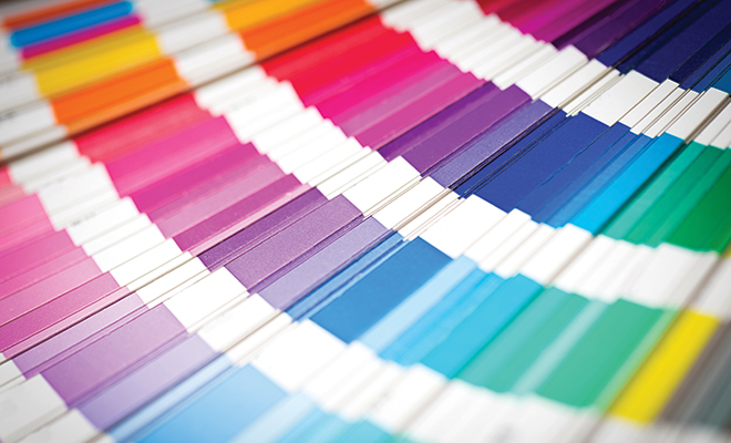
Forecasting the colors that consumers will love is a job that’s part art and part science. Luckily, the experts at the Pantone Color Institute take the job very seriously. Each year, they come up with groups of color combinations called palettes that they project to be trending for the upcoming year in interior design. The 2019 forecast was announced at the International Home + Housewares Show in Chicago last spring by Leatrice Eiseman, Pantone Executive Director and color expert for the International Housewares Association. You can expect to see these forecasted colors in retail stores over the next few months.
Sameness is boring for many people when it comes to home furnishings. An exciting new color combination may be enough to spur a new purchase. Color is also a differentiator that can make a consumer chose one product over another. Pantone’s goal is to help designers and retailers stay ahead of emerging color trends and provide products that consumers will gravitate towards.
According to Eiseman, “It takes a lot of hard work by many people to come up with the palettes, and a lot of research into current trends, philosophies and ideas are involved. As most of you here would know, global trends are reflected in color. Those trends are where we gather our inspiration.”
Eiseman and her team look at fashion, films and design as well as social movements, food and consumer products in order to forecast which colors will be trending. For example, the costumes in the film Black Panther could create a trend for deep shades of black paired with shocks of bright orange and red.
The Pantone Home + Interiors color projections are divided into eight palettes with nine colors per palette. Each palette expresses a theme, mood or spirit. In its press release announcing the color picks, Pantone highlighted two palettes: Cravings and Classico.
The Cravings palette pays homage to foodie culture by combing Butterum and Cappuccino neutrals and shades of red, orange and purple with names like Cayenne and Chili Pepper. The palette is designed to “draw upon memorable sensory experiences to inspire new ones that will be just as pleasing.”
The Classico palette lives up to its name by delivering updated versions of classic neutrals and colorful jewel tones. According to Pantone, colors like Mallard Blue, Rich Gold and Apricot Brandy are “fundamental, basic, and everlasting, while at the same time elegant and forever fashionable.” Neutrals in the palette include Swan White, Camel Tan, Gray Flannel and Caviar Black. Rich Gold is also included on the palette, a sign that metallics are still trending.
These are the additional Pantone color palettes for 2019.
Syncopated. The brightest shades of yellow, red and orange contrasted by a popping shade of white give this palette a feeling of energy and exhilaration.
Paradoxical. This palette includes unconventional pairings, mixing traditional and modern with high and low style. It includes colors like Placid Blue, Pink Peacock, Dark Green and Galaxy Blue.
Musings. There’s room for soft colors among today’s current trends. This palette consists of hushed shades that convey a relaxed and healthy lifestyle, including Herbal Garden Green, Cloudburst White and Gray Mist.
Cherish. This palette uses soft tones of pink and red along with texture and pattern to create a quiet refuge for the senses. It’s meant to evoke memories of comfort and contentment.
Meanderings. The love of travel and adventure is represented in this color group. The name implies a winding road taken at a slow pace so that unexpected pleasures of the journey can be discovered. Colors on the palette are saturated shades of green, purple, blue, brown and burgundy.
Proximity. This palette reflects the hybrid nature of life in the 21st century, where nature and technology must co-exist in close proximity with mixtures of turquoise and teal along with more primary blues and greens.
In announcing the color palettes for 2019, Eiseman mentioned the continuing popularity of shimmering surfaces and materials in the home. As humans, she said, we are always attracted to shiny things. Expect to see these materials used in a wide range of household items, from cooking and cleaning utensils to furniture.
Eisenman also highlighted the importance of black and white. These colors are “a given” she said and will never go out of style. What changes through the years is how they’re combined with color. Designers and retailers must continually reinvent how they use color with black and white in order to grab the attention of customers.
The New York Times Magazine reports that Pantone’s color-related products are used by 10 million designers and manufacturers around the world each day. To find out more about Pantone’s color forecasting, visit Pantone.com. ■
Sources: The Pantone Color Institute, the New York Times Magazine and Gifts and Dec Magazine.


