The Art and Science of Color: Pantone Color Predictions for 2024
Color is an essential element of home design. The hue and brightness of a room’s walls and furnishings can set the mood of the entire room. It’s no wonder so many people hire a professional decorator to help coordinate their home’s colors. These professionals balance current trends, client taste and a room’s natural lighting to come up with a pleasing, coordinated palette.
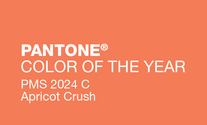
The Pantone Color Institute is a valuable resource for home decorators who are interested in color trends. Pantone’s annual color picks predict trending color combinations for the year ahead. The home color palettes are traditionally announced at the Inspired Home Show by Leatrice Eiseman, executive director of the Pantone Color Institute.
According to Eiseman, art and science will be important influences on color trends for the home in 2024. In her keynote address, she mentioned the residual effects of the recent pandemic: “We are still…emerging from the anxiety that has engulfed us in the last few years. We can’t ignore that. We know that no matter where we are in this ongoing process, it’s left an indelible and emotional mark on our lives that seeks relief, renewed optimism and rejuvenation.”
Art is important for healing, continued Eiseman; it exercises the imagination. There’s a renewed interest in surrealism, where dreams are portrayed as an escape from reality. Science is important; it appeals to our logical side with explanations for life’s mysteries. Water is evolving as a design theme, boosting the popularity of blue palettes and products made from materials associated with the ocean.
She concluded by unveiling the seven Pantone View Home + Interiors palettes for 2024. The palettes described below are not merely collections of colors; thanks to the researchers at the Pantone Institute, they are windows into our collective need for colors that soothe, nurture, delight or excite.
Sustenance
This captivating palette is an ode to timeless traditions of entertaining and dining. Sustenance transcends mere color; it weaves a tapestry of emotions associated with creative cooking, love, laughter and the joy of sharing. It draws from a lush spectrum of greens, soothing blue-greens, a playful yellow-green, complemented by deeper, more profound tones and a subtle suggestion of pink.
Replenish
Aptly named a “water-born palette,” Replenish embodies the calming serenity of aquatic hues. Dominated by various shades of blue, it introduces a refreshing twist with hints of apricot and soft pink, infusing a sense of renewal. This palette resonates with themes of self-care, rejuvenation and the soothing rituals of a relaxing bath. It’s a palette that balances life’s chaos with a tranquil oasis of colors.
Creative Mixology
Eiseman enthusiastically introduced Creative Mixology, a palette that sparks individuality and experimentation. It’s a playful medley of colors, encompassing every family in the color spectrum, including earth tones. This palette is all about creative freedom and the unbridled joy of mixing the old with the new. It’s a canvas for free-spirited aesthetics and a testament to the unending possibilities of design.
Sanctuary
Sanctuary is a haven of softness and steadiness. With delicate pastels, comforting mid-tones and a grounding chocolate brown, it creates an environment of relaxation and harmony. Offering a tranquil refuge from the complexities of the modern world, this palette strikes a perfect balance between simplicity and innovation.
Stylist
Inspired by the convergence of fashion and design, Stylist is a captivating blend of blues and teals, adorned with the elegance of metallics. The soft sheen of these metallic elements is reminiscent of undulating water. Stylist is a bridge between the traditional and the contemporary, possessing universal appeal and the potential to transform any space into a timeless masterpiece.
Surrealism
Surrealism offers a whimsical escape from the mundane with its unexpected and unconventional color combinations. Described as “illogical, quirky and witty,” it invites us into the world of uninhibited dreams. This palette transcends the conventional boundaries of color, encouraging us to embrace the unexpected and let our imaginations run wild.
Scenic
Inspired by the vibrant hues found in nature’s light spectrum, Scenic is a dynamic and visually captivating palette. Imagine the brilliance of flashes of lightning, the mesmerizing beauty of bold sunsets, and the magical reflections of bright colors on clouds. Scenic combines pinks and purples with the warmth of oranges and orange-pinks, along with grounding earthy tones, to create a visually stunning effect. It’s a palette that captures the beauty and drama of the natural world and brings it into our interiors.
The Pantone View Home + Interiors 2024 palettes are more than just color schemes; they are gateways to a world of creativity and design possibilities. Each palette has a distinct personality, offering a unique journey into the realm of aesthetics, emotions and imagination. Design enthusiasts and professionals alike will find these palettes inspiring and invaluable in their creative projects.
Sources: housewaresnews.net, homepagenews.com, theinspiredhomeshow.com, meccinteriors.com, and pantone.com.


