
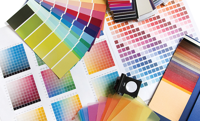
Pantone’s 2017 trends spice up our homes
If you’re wondering which home decorating colors will be trending in 2017, the best place to start is with the Pantone Color Institute’s Home + Interiors color palette predictions. Each year, the famous color authority defines key groups of colors that consumers can expect to see in new home furnishings and accessories.
Pantone executive director Leatrice Eiseman revealed the 2017 color palettes last spring at Chicago’s International Home + Housewares Show, so designers and manufacturers have had several months to add the colors to their collections. The theme of this year’s color palettes can be described as combining the familiar with the unexpected. According to Eiseman, color and design are currently at a crossroads due to consumers’ constant desire to see something new. The challenge for designers is to provide new color combinations without going outside consumers’ comfort zones. This means tweaking familiar color palettes by combining the familiar with the unexpected to make shoppers stop and take notice.
Eiseman also mentioned how popular culture can influence consumer color choices, such as a continuing interest in metallic surfaces that Pantone attributes to recent Star Wars sequels. The bright, vibrant colors seen in The Peanuts Movie and Disney’s Inside Out were also cited by Eiseman as important trends.
Are you looking for some color inspiration for your home? Here’s an overview of the nine new Pantone Home + Interiors palettes for 2017.
Day Dreaming
Pantone committed to pastels last year by choosing two light shades, Rose Quartz and Serenity blue, as its 2016 Colors of the Year. The pastel theme continues in the Day Dreaming palette, where Rose Quartz and Serenity are coordinated with soft Yellow Iris, Nile green and neutral shades of gray and tan. The palette is meant to evoke serenity and lightness as a remedy to the daily stresses of modern life.
At Ease
This palette is also about serenity and stress reduction, but it greys down its pastels for a sophisticated effect. Neutral shades of tan and brown combine with muted tones of blue and pink to create an overall feeling of effortless relaxation.
Native Instincts
This palette draws on the aesthetics of a wide range of native peoples, from the earth tones found in Native American pottery to the vibrant shades in handwoven Turkish rugs. Unexpected combinations in this palette include shades of brown and sienna next to pale turquoise, smoky orchid and Carmine red.
Florabundant
As its name suggests, this palette reflects the current popularity of floral prints in fashion. These are the deeper and more dramatic shades of late summer flowers rather than the bright blossoms of spring. It includes sumptuous hues with names such as Pink Yarrow, Red Dahlia and Chrysanthemum, along with two shades of green.
Acquired Taste
This palette pays tribute to unique color combinations with a grouping of colors that Pantone describes as “subtly luxurious.” Pale Gold, Mulberry Brandied Melon and Orange Chiffon are a sampling of the romantically named colors included on this palette, along with muted shades of grey and pink.
Forest Bathing
The theme of stress reduction appears again in this palette along with the use of green, which Eiseman singles out as a popular color. The Forest Bathing palette takes inspiration from Shinrin-yoku, the Japanese practice of “taking in the forest atmosphere.” Like a contemplative walk in the woods, this palette includes several shades of green, from deep hunter to vibrant Acid Lime. Sky blue and wildflower-inspired pink and purple are also included for contrast.
Reminiscence
Nostalgia and a walk down memory lane are the inspiration for this palette. Its colors manage to evoke several different eras, with ultra-traditional colors such as Maritime Blue and Sepia Tint included as well as midcentury modern Martini Olive green.
Raw Materials
This palette represents the use of natural materials in the home, which Pantone cites as part of a larger health and wellness movement. Natural shades of gray, brown, green and blue are contrasted with Zephyr pink and yellow.
Graphics Imprints
Here we see the playful side of design as well as the interaction between black/white and color. This palette, which Eiseman describes as “great fun,” begins with a foundation of black and white and then mixes in vibrant shades with names such as Fandango Pink, Orange Popsicle, Dazzling Blue and Blazing Yellow.
Pantone publishes its color picks each year to inspire designers and consumers rather than to dictate colors to be used. Don’t expect to see these new color combinations only in contemporary home and houseware designs. According to Eiseman, vintage and retro looks will continue to gain in popularity. “Rescue is the new buzzword that’s replacing recycling.” So if you’re combining vintage pieces, you can pull them together with one of the color themes in Pantone’s palettes. ■
Sources: housewares.org and pantone.com.


