Pantone®: Predicting 2020 Color Trends
Using color in the home to create a mood or make a statement requires a special skill that’s part art and part science. For interior decorators, designers and houseware retailers, picking colors that resonate with customers and clients can mean the difference between success and failure. Luckily, the experts at the Pantone Color Institute make the job a bit easier with their annual color trend forecasts that were revealed last spring at the International Home + Housewares Show in Chicago.
The theme of this year’s color forecasts is Color for a New Era: Trends, Twists and Tweaks. One of the important twists is the combination of muted and vibrant tones in novel ways. “Prepare for a kaleidoscope of colors in the next two years,” says Leatrice Eiseman, Pantone Color Institute’s executive director. “Diverse color palettes with never-ending patterns and combinations will be the name of the game more than ever before.”
Eiseman and her team at Pantone look at a diverse range of influences to come up with their home design color forecasts, including film, television, food, technology and art. She cites the movie Mary, Queen of Scots for its Elizabethan color styling as well as the bold colors of a recent Andy Warhol art exhibit as sources of inspiration for their 2020 forecast. The health and wellness movement, which is associated with softer, more relaxing hues, was another important source of inspiration.
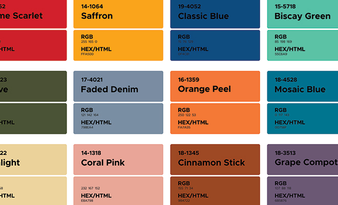
Pantone summarizes their home and housewares color forecast with eight palettes that represent individual trends. Each palette consists of nine coordinating and contrasting colors that convey a specific mood or idea. In the book PANTONEVIEW home + interiors 2020, which can be purchased on Pantone’s website, a series of inspirational images accompanies each palette.
These are the 2020 Pantone color palettes:
Metropolis
The colors in this palette represent the modern urban environment, where warehouses and gritty streets contrast with towering skyscrapers made of glass and steel. The overall theme is glamour meets industry. There are several shades of gray, tan and rust included. There’s also a brilliant blue and jet black, which seem to represent the day and night skies over the city.
Trekking
Those who love the outdoors will appreciate the Trekking palette. A mix of bright colors such as yellow and cyan are combined with natural shades of green and tan, evoking a hike in the mountains or an afternoon at the lake. A faded red is reminiscent of a comfortable flannel shirt while a bright blue evokes a favorite pair of jeans.
Tea Garden
This palette is inspired by the natural beauty of a Japanese tea garden, where the overall mood is thoughtful and imbued with simplicity, respect and harmony. The colors encourage us to slow down and appreciate the shades of nature: blue for the sea and sky and green for trees and plants. Chai, mango and lavender are included, as well as a metallic green-blue named Beetle Wing that was inspired by the Japanese beetle.
Skill Set
The continuing interest in handcrafted objects is reflected in the colors of this palette. According to Eiseman, the neutral colors are inspired by tooled leather, handmade pottery and wine-soaked wooden barrels.
Beyond the Pale
This palette takes pastels to the next level, adding a smoky element to shades of pink, green, blue and tan. The effect is relaxing but never boring. Influences cited by Eiseman for the palette are modernism and multiculturalism.
Tempered Tastes
Pantone recognizes that neutral colors will always be popular in home décor. In this palette, understated neutrals such as tan and cream create a mood of quiet contemplation. Shimmering metallic shades of rose and gold add a touch of elegance.
Show Stoppers
This palette was designed for kids as well as the young at heart. Like a jar full of jelly beans, vibrant colors with names such as Spectra Yellow, Leprechaun Dust and Twinkling Diode Blue bring a sense of energy. Shades of orchid and orange are also included.
Prints Charming
As the name implies, the Prints Charming palette is based on fantasy. It’s represented by a photo of a model dressed as a modern Prince Charming, royally attired in bright shades of red, blue and yellow. In a modern twist, the prince has elaborate patterned tattoos. The palette also includes muted shades of brown and green as well as white and black for contrast.
In addition to defining color trends for the home, Eiseman also commented on popular materials for the home in 2020 during her keynote speech in Chicago. Marble, especially terrazzo, formed with marble chips in a matrix, is expected to be popular. Metallic finishes will also be on trend, especially when combined with natural wood textures. It’s all about the contrast of smooth and textured surfaces as well as modern and traditional design elements. ■
Sources: housewares.org, icanvas.com and pantone.com.


