Pantone Color Predictions for 2021
There’s a famous scene in the film The Devil Wears Prada in which Meryl Streep, playing a fashion magazine editor modeled on Vogue’s Ana Wintour, explains to a new hire played by Ann Hathaway how the color of her inexpensive sweater was influenced by a previous designer runway show. Scenes like this enforce the idea that consumer color trends are dictated from on high by designers and manufacturers.
The reality, according to color expert Leatrice Eiseman of the Pantone Color Institute, is quite a bit more complicated. Fashion and home designers are influenced by current events as well as a wide range of industries when making color choices, including art, cosmetics, entertainment and technology.
Each spring, Pantone presents color predictions for new home products at the International Housewares Association show in Chicago. These predictions give designers and manufacturers key insights into consumer trends that will influence purchases in the coming months. Although the March 2020 show was cancelled, Eiseman revealed Pantone’s home color picks in April via webinar.
Innovation will be one of the biggest influences on 2021 trends, according to Eiseman. In color, this means edgier and even humorous color combinations. Some customers will always favor traditional hues, but traditional colors will be combined in unexpected ways. Eiseman sees film as a major influence in the upcoming year due to everyone’s increased reliance on television and streaming services for entertainment. For example, she expects more people to be open to vivid shades of blue following December 2021’s release of Avatar 2.
Wellness has been a big trend for several years and will only get bigger in 2021. It’s associated with pastel colors that convey “calm, confidence and connection.” Eiseman also said that concern about the environment has turned sustainability into a mainstream trend, reflected by the desire for eco-friendly home products.
During her presentation, Eiseman unveiled nine 2021 Pantone View Home + Interiors palettes. Each palette includes a group of coordinating colors that reflect all the trends in today’s home marketplace.
Composed
A neutral palette is included each year by Pantone to satisfy consumers who favor neutral colors in the home. The Composed palette plays this role with muted pastel shades of pink, yellow, tan and blue combined with several darker shades of blue and gray. The overall feeling is one of harmony, comfort and familiarity.
Fleur
This palette is right at home in a rose garden. It includes a range of pink shades, from softest petal pink to deep burgundy, along with shades of green and gold. The result is a valentine for the eyes. According to Eiseman, this palette is “not just about a sweet bouquet” but is “a bit sexier” thanks to deeper shades.
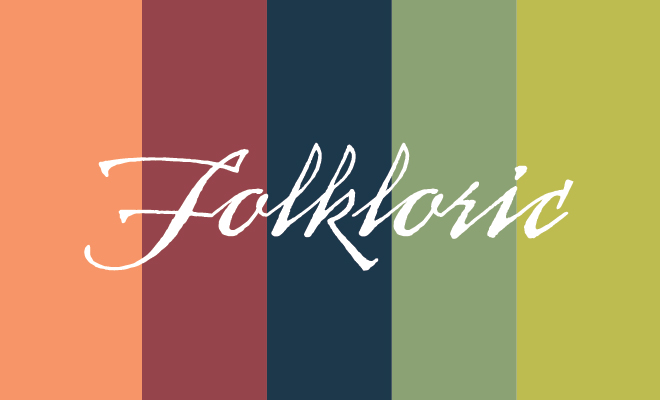
Folkloric
In a tribute to handmade goods, the colors in this palette are intended to look like they were dyed with natural materials rather than chemicals. Included are deeply saturated shades of orange, magenta, indigo and fern green. Eiseman says the palette may feel Nordic, but “it’s really about a new and energized form of folk art.”
Galaxies
Humanity’s ongoing interest in space exploration inspires this palette of metallic tones. Shades of silver, bronze and lapis are combined with darker neutrals; the earthier tones help ground the metallics, according to Eiseman.
Quixotic
The term quixotic is defined by Merriam-Webster as “foolishly impractical.” This palette includes a bright rainbow of colors that offer unique contrasts, such as Jade Lime combined with Peppery Cayenne.
Polychrome
A renewed interest in patterns was the inspiration for this group, which includes colors derived from architectural details from a variety of regions around the world. Sophisticated shades of lavender with names of Sheer Lilac and Quartz Pink are contrasted with Spicy Mustard and a chocolatey-brown Mocha Mousse.
Synergy
This palette is named for the phenomenon in which the connections between two or more entities produce a combined effect greater than the sum of each separate effect. Included are four shades of blue and blue-green and four shades of lilac; all colors have been “grayed-down” to create “peaceful, pleasing connections of color.”
Terracotta
It’s born from concern for the natural world; Pantone for the first time used a single color as the inspiration for an entire palette. Along with several shades of the earthy main color, the Terracotta palette also includes coordinating shades of blue, green and pink. The combination evokes soil, sky, plants and flowers, bringing the outdoor environment into the home.
Vivify
In contrast to the neutrality of the Composed palette, this “eclectic grouping” includes happy and playful colors with names such as Raspberry Sorbet and Wild Lime that are meant to invoke a feeling of positivity. Black and white are also included on the palette to provide contrast.
You can find out more about Pantone color predictions for 2021 by visiting pantone.com. ■
Sources: theinspiredhomeshow.com, pantone.com and meccinteriors.com.


