


5 Tips to Make Your Interior Pop
If you have been avoiding adding color to your home’s current décor, maybe it’s time to ask yourself, “Why?” Many times fears reside in the back of our minds. I fear color won’t complement my current décor. I fear I will choose the wrong color combinations. I fear I will not love my chosen colors in the future. All these fears leave us sticking to a neutral palette, and although neutrals can be very beautiful and sophisticated, most of us would love to add a little “spice” to our life.
Let’s wash away all our fears about using color with these five easy-to implement tips for making your interior pop.
1. Choose a complementary or analogous color scheme.
As you start down the road to choosing a color scheme, simplify the process by giving yourself only two options to choose from: complementary or analogous. Pull out your color wheel and let’s get to work.
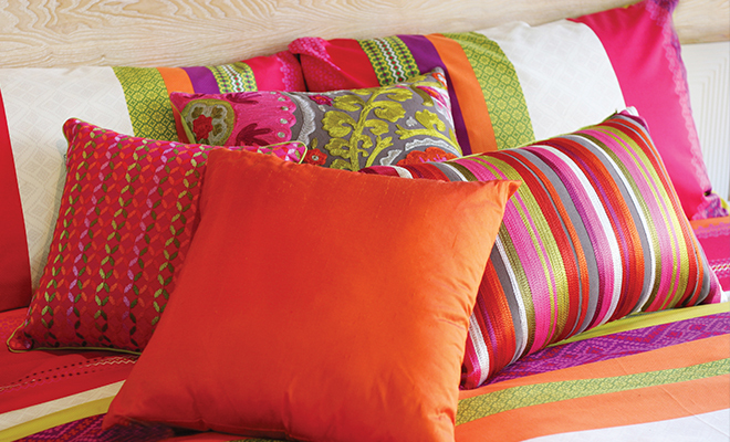
Complementary color schemes are created by utilizing colors across from each other on the color wheel. Think red and green, blue and yellow, purple and orange. Through these combinations you will create a more formal environment that provides a defined separation of colors.
Analogous color schemes use colors next to each other on the color wheel. This time think yellow and green, blue and violet, red and orange to create a more casual setting. These color combinations are seamless, evoking rest and relaxation.
2. Develop a flow.
Consider utilizing a flow of color throughout your home. Choose one color that you love and use it in differing amounts in your adjoining spaces. For example, use blue throughout several rooms to unify the home. Use various degrees of blue and if you do not like to be overwhelmed by blue in any one space, you can always use this color as an accent color.
3. Take notice of your outside environment.
Choose colors that reflect the area in which you live. You can even study the color schemes of historical homes in your community and build a beautiful room by incorporating design and color schemes based on these historic models.
The easiest environmental factor to observe is the current season.
Each season brings forth its own color combinations that are acceptable inspiration for decorating. For example, spring normally embraces pinks, lilac and yellow for a bright, renewed look.
4. Use black as an accent.
Choose a simple black element to add to any room. Any black accent will work well to clarify and enhance your chosen colors in any space. Get inspired with a black headboard in the bedroom, black paint on an accent wall or even a simple black lampshade.
5. Two design tips to get you started.
If you’re still not sure where to start when adding color to your space, follow these two simple examples of how to get started:
The tip is to remember the 60-30-10 rule, which refers to three colors being used in varying percentages: 60 percent of your space is a dominant color, 30 percent is a secondary color that adds visual interest and 10 percent is an accent that adds a little spark. Instead of racking your brain to figure out how these percentages will break down in your space, start off with this simple formula:
Dominant color: paint your walls this color
Secondary color: upholstery or furnishings
Accent color: think small with items such as candles, flowers or coasters
The second tip pulls directly from nature. People often speak of nature’s beauty, so why not mimic the natural beauty of the great outdoors to create a balanced space. The goal here is to avoid one side of the room becoming too dark while the other side becomes too light. We accomplish this task by balancing the room from the floor up. Choose a dark shade for the floor, a medium shade for the walls and a light shade for the ceiling. If you prefer to keep your wall paint light, utilize wall art to create the balance. You will be visually mimicking the ground, the mountains or tree line and the sky, the perfect balance created by Mother Nature herself. HLM


