
2018: Coloring Your Life with Pantone
For the past several years, each January issue of HERLIFE Magazine has featured an article on the Pantone Color Institute’s Home + Interiors color predictions for the upcoming year.
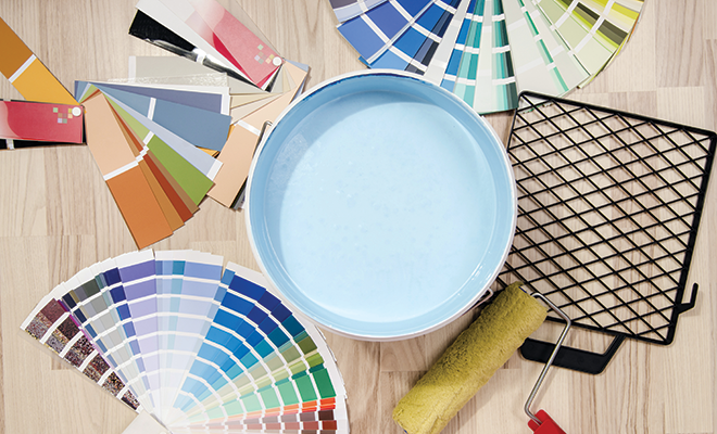
These predictions, which consist of eight themed color palettes, help designers and manufacturers make color decision that accurately reflect the current market. For consumers, the 2018 color palettes provide a sneak peek at color combinations we’ll see in the stores in the months ahead.
This year I was lucky enough to speak with Pantone Executive Director Leatrice (Lee) Eiseman about the 2018 Home + Interiors colors. Lee is an internationally renowned author and colorist who provides color consulting services to a clients in a wide range of industries, from fashion and interior design to manufacturing, marketing and advertising. Here’s a bit of our conversation.
Q. What can HERLIFE readers gain from the Pantone color predictions?
A. Empowerment. We hope to let everyone know that there are no hard and fast rules about color. Many people lack confidence about using color and combining colors, but most people can learn about color and then follow their instincts. All of us have favorite colors that we’re drawn to, so go back to what pleases you, speaks to you and makes you happy.
Q. How important are color trends?
A. Of course there are always practical considerations when it comes to trends, such as how long something will be in style. A basic guideline is not to be so practical that you can’t enjoy the colors you love.
Trends are useful when you need a change. They can help you refresh a room. It doesn’t necessarily have to be something big. You can buy into a color trend with accents to a room. Think beyond throw pillows; paint is one of the least expensive ways to change a room. Changing the color of just one wall can provide instant gratification and instant transformation. All you need is a can of paint and some grunt labor!
Q. How can readers become more educated about using color in their homes?
A. There is always more to learn about color, including how color choices are influenced by psychology and how color affects mood. There are no ugly colors; it’s all about context and attitude, about how a color is used.
Eiseman talked about top color trends for the home last spring when she unveiled the 2018 Home + Interior colors at the International Home + Housewares Show in Chicago. One of the biggest trends is for metallic tones, which Eiseman says have taken on a neutral role. Iridescent, pearlized and translucent surfaces that attract the eye are also trending. She noted a trend away from pastels, with intense colors and bold combinations as “a natural application of our intense lifestyles and thought processes.” She also linked intense colors with a growing trend for exotic and escapist design motifs, including animals and jungles.
The details about the 2018 Pantone Home + Interiors color palettes describe some interesting new trends.
Resourceful
This palette consists of varying shades of blue and orange, ranging from peach and turquoise to red-orange and navy. It’s a perfect example of this year’s intense color combinations. According to Eiseman, the Resourceful palette “combines warm and cool tones that you just can’t avoid looking at.”
Verdure
The palette takes inspiration from the plant kingdom, combining shades of green with names such as Celery and Foliage with an eggshell blue and berry-infused purples. The colors symbolize health, according to Eiseman.
Far-fetched
With warm, earthy hues including Cornsilk Yellow blending with rosy tones of peach, pink, lavender and plum, this palette “reaches out and embraces many different cultures,” said Eiseman.
Intricacy
The palette is composed of metallics in shades of silver and black, the new neutrals, with accents of dramatic Holly Berry red and yellow Sulfur.
Intensity
An eclectic mix of red shades with blue and green, Intensity evokes a sense of strength, power and sophistication, balanced with touches of black and gold.
TECH-nique
Pantone gives a nod to technology with bright pink, purple and turquoise color shades. It’s all about hues “that seem to shine from within,” Eiseman described.
Playful
Fun colors are included in this quirky color scheme, because “people need to stop and smile.” Perfect for a child’s bedroom, the Playful palette includes bright Minion yellow, Lime Popsicle green, Skydiver blue and two shades of pink.
Discretion
Described as the Playful palette’s alter ego, Discretion is defined by strong but subtle hues such as Elderberry and Hawthorne Rose, along with diffuse shades of blue and gold.
If you’d like to learn more about choosing colors and the psychology of color, check out Leatrice Eiseman’s latest book, The Complete Color Harmony, a completely revised edition with new color palettes published in September 2017. ■
Sources: elledecor.com, housewares.org and pantone.com.


